

Book Covers

Hello dear newsletter people,
I thought I’d share some thoughts about book covers today, but first, their spines. As a student, having occasionally been crushed to realise I’d spent my book budget on the wrong novel,1 I got into the strange habit of shopping by publisher, after noticing the books I loved most consistently at that time were put out by Bloomsbury or 4th Estate. My browsing technique consisted of scanning half an inch above shelf-level for their logos and from there it was a bit like a chameleon whipping out its tongue to snaffle a fly, but with a hand and a book. It ended up being an unexpectedly reliable formula during those years, although thankfully, the advent of online reviews has meant my reading has since extended beyond two publishers.
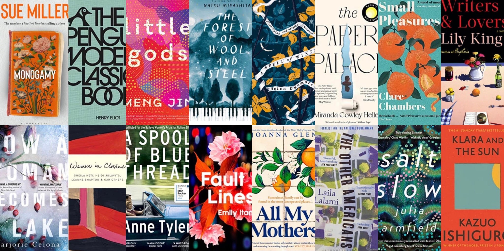
On to the covers. Until a few years ago, I used Instagram almost exclusively to follow fellow craftspeople, but gradually realised that whenever I happened to see a book cover in my feed, it brought just as much as happiness as the sight of a quilt….and then I wondered why I’d used Instagram exclusively for one thing, when it could be lots of things. But anyway, my point is that seeing books makes me happy - they are cosiness and possibility, and also something indefinable that I will just call nice2. I think that’s true irrespective of genre, but there’s also something lovely about honing in on which books are for me - I think those first moments of entering a bookshop are an almost creaturish experience, nose twitching at the air, absorbing all the book cover messaging to take us to just the right browsing spot. There are overt symbols that mark a genre, such as gold serif fonts that drip with blood, but it’s the things that subtly define sub-genres that make me appreciate what an art form cover design is: when I see the elaborate jackets for novels by writers such as Bridget Collins, Sarah Perry, Michelle Paver, and Diane Setterfield, I’m drawn to stop and take in all the gorgeous details, but I’m also immediately aware that what lies inside is not for me; this jacket style signifies literary fiction with a ghostly / magical / fantastical bent, where I crave total realism.
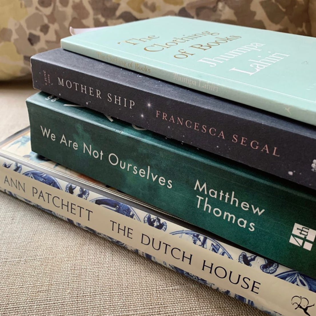
It seems an author generally has very little say in her book’s cover, and many writers have spoken about this - rifling through the shelves in Much Ado Books in Alfriston one day, I came across a tiny edition by Jhumpa Lahiri (whose novels and short story collections I adore), called The Clothing of Books. It has the most exquisite duck-egg cover, which you can see at the top of the pile above3 . It can be read in less than an hour, but it’s full of interesting thoughts and ideas and when it comes to Jhumpa’s own covers, she shares a particularly bizarre incident where, after complaining that her book’s cover was decorated with elephants and henna-ed hands, which seemed like stereotypes for a protagonist born and raised in the US, she was presented with an alternative cover where they’d replaced one of the motifs with an American flag to bring more cultural balance… It’s a few years since I’ve read it, but one of my abiding memories is of Jhumpa saying how she hated one of her book covers with such passion, that when someone brought it to her at a signing, she wanted to tear it from the pages.
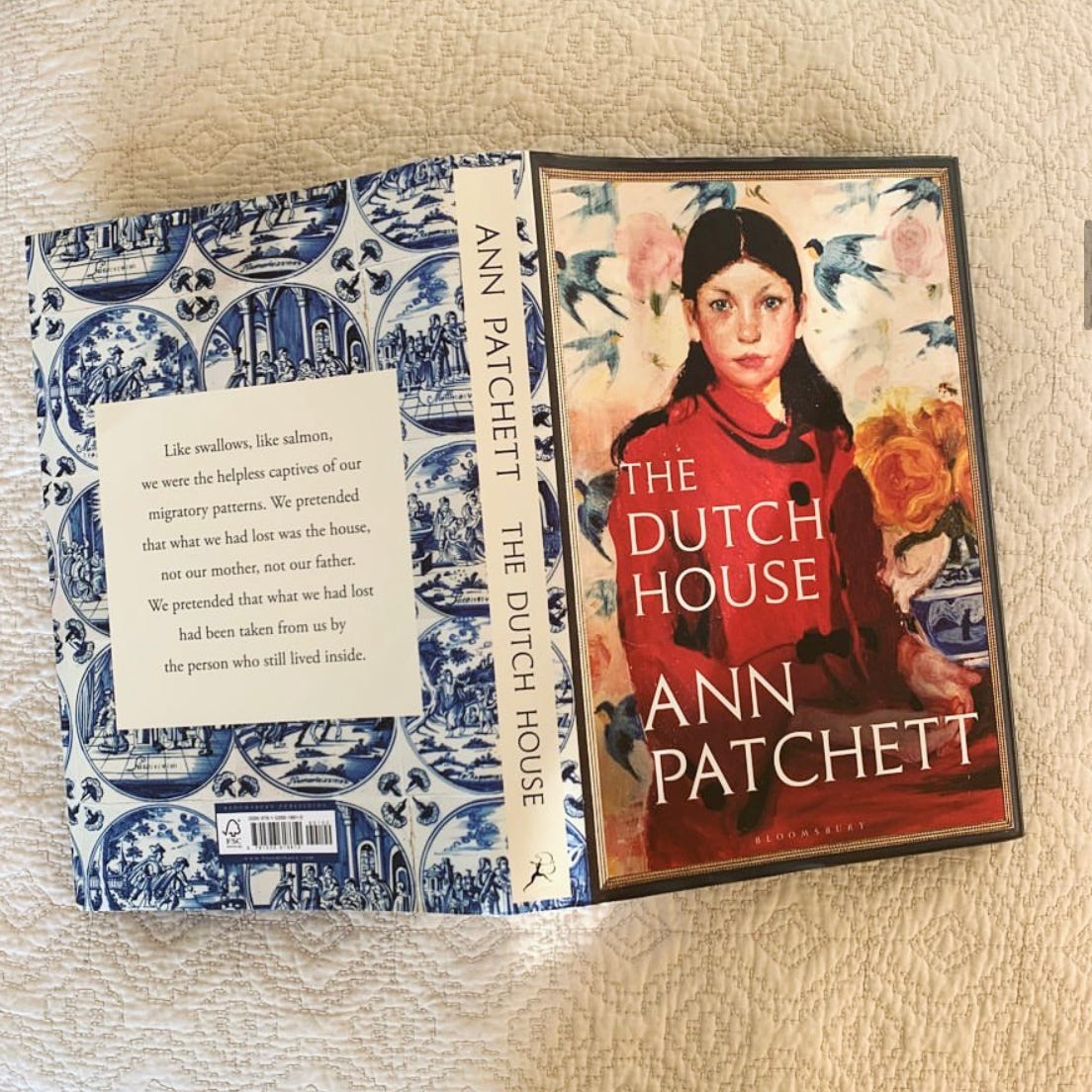
Ann Patchett seems to have broken a publishing mould in designing her own cover for her 2020 novel, The Dutch House - she talks about how that happened in this video - do watch if you have time as it’s really interesting (I could listen to Ann talk all day and love the Laydown Diaries posts she does on Instagram. Also, the shop dogs). And in some ways, it makes sense - I love Ann Patchett’s writing and the things that come from her head, so why wouldn’t I want to also see the cover she envisages wrapping around her work. But perhaps this idea breaks down if an author has less of an innate instinct for what will and won’t work visually, and also, critically, what will sell - Ann is the co-owner of Parnassus Books in Nashville, so has years of experience when it comes to knowing what leaps off the shelves. Ann continued on her self-designed cover streak with her most recent collection of essays, These Precious Days, independently commissioning another artwork. Even better, this book contains a whole essay on the covers she’s loved/endured, including the backstory for this book’s own design - I’d been wondering about it all the way through, so could barely contain my delight when I discovered a whole essay devoted to it near the very end. Delicious.
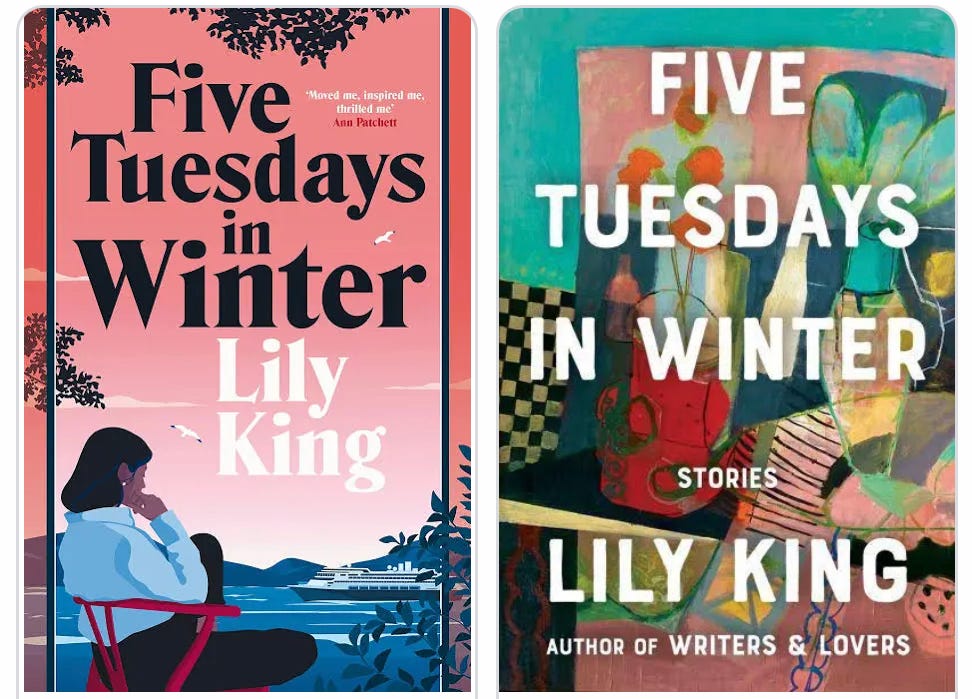
One of the things that always interests me is seeing how book jackets vary from country to country, as when the rights to a novel are sold overseas, the publisher is usually able to repackage it with their own choice of cover. I found the comments to this post from Joanna Goddard of Cup of Jo really interesting - Joanna lives in Brooklyn, New York, and shared the US and UK covers of Monica Ali’s Love Marriage (which I’d recently read), asking her followers which they preferred - the comments suggested readers often dislike their own country’s covers. And actually, when the cover to Lily King’s recent book of short stories changed somewhere across the Atlantic, I was devastated - it had been right at the top of my wish list for some time, but when it was finally published in the UK (below left), my desire for it plummeted…it just didn’t grab me in the way of the painterly wonder US version (below right).
I think Jhumpa Lahiri’s term, The Clothing of Books, really sums up the book cover experience for both the author and the reader: the author, along with their words, is essentially being dressed by someone else and they might just as easily find themselves rustling down the street in a shell suit, as an exquisitely-printed dress. As readers, we have more choice in the matter, but the covers we reach for are still a partial reflection of ourselves - the success of special editions, Penguin’s Clothbounds, or a brand like Persephone (known for their minimalist grey & cream jackets and patterned endpapers) relies on this.
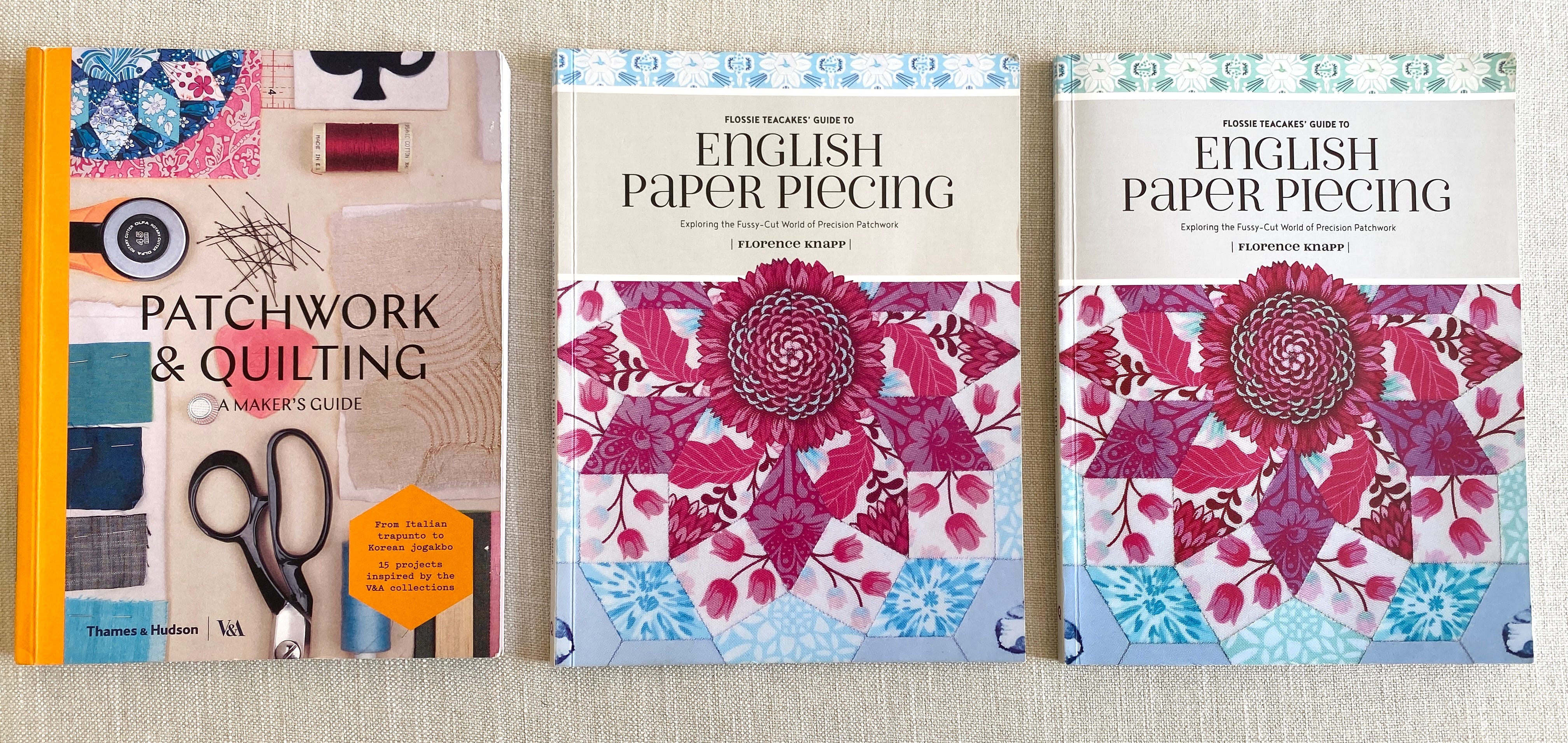
It seems odd to write this without commenting on my own cover experience - so here, a few thoughts on that too: When the proofs arrived in my inbox, I was relieved as I loved what the designer, Pamela Norman, had put together - it felt like she’d magically intuited exactly how I might like my book to look. My only issue was with the strap-line my publisher had chosen - in reality, it’s so small you’d barely notice it, but for a while it loomed large, as it initially read: Exploring the Fussy World of Precision Patchwork - if ever there was a phrase that seemed to denigrate that which it sought to promote, to me, that was it. The word fussy is a reference to fussy-cutting, a technique used in English paper piecing where a certain section of a fabric’s design is featured, but in isolation its meaning felt entirely different to me. After some of back and forth (aka, polite pleading), it was finally agreed they’d tweak it to: Exploring the Fussy-Cut World of Precision Patchwork - the addition of the word cut was gratefully-received and overall my cover experience was a happy one. Note that print colours vary hugely from printer to printer (I saw this myself when first venturing into Giclée prints) and that’s reflected in the difference in colours between print runs that you can see below - the copy in the middle was printed in the US, and the one on the right, in the UK.
Not really mine, but when it came to seeing the cover of the book I’d contributed to for the V&A (above left), I was delighted - not only was there the surprise of seeing a snippet of one of my quilt blocks on the cover (top left), it was also my favourite of the three I’d contributed - it still makes me happy whenever I catch sight of it, partly because it feels like a joy I share in with its original maker, as my blocks were based on ones from the 1797 ‘Sundial’ coverlet in the V&A’s collection, the stitcher’s initials, CMB. Retracing CMB’s steps gave me such an intense sense of connection with her4 - I’ve talked a little about the choices she made with fabric and placement here, but CMB actually inspired other projects for me, too - if you look at the original, you’ll see she’s sewn part of the British Isles in the bottom corners of her coverlet, which is where the idea for my map of the UK came from (there are A3 prints in my Etsy shop, here).
Finally, a few more textile/book cover crossover links. First, Margaret Fleisher - I think I first came across Margaret’s work in 2020, during the early months of the pandemic, and was just blown away. At that time, Margaret was immersed in a project recreating book covers as abstract quilt blocks - I think there’s something mesmerising about seeing one art form translated into another - it feels a bit like magic. I loved studying Margaret’s decisions around which elements to transfer across in order to retain the essence of the original cover. Do go and take a look - I promise you’ll be blown away (in the same vein, Jenni Smith & Kay Walsh have launched a Patchwork & Prose block of the month with Quilt Folk for stitchers wanting to follow a similar path in the company of other stitchers).
And finally, this morning, Kate (who owns this wonderful fabric shop) reminded me of Yinka Shonibare’s exhibition at the Tate, featuring books bound in African wax print fabrics, which you can read about here (if you’re interested, you can also visit this page to see some of the stories people have shared in response to Yinka’s work).
And we’re done (well, I am - you still have some excessively long footnotes to read ;)
With love, and thanks for reading,
Florence x
Ps. A late addition: Tanya, who often emails with the most amazing reading suggestions in response to my newsletters, messaged me this morning with a link to this online Faber event - it’s on the more geeky Production side of things and discusses spec, typesetting, printing etc, using Kazuo Ishiguro’s Klara and The Sun as the case study :) You have to be a Faber member to attend, but that’s free and really just involves receiving interesting newsletters.
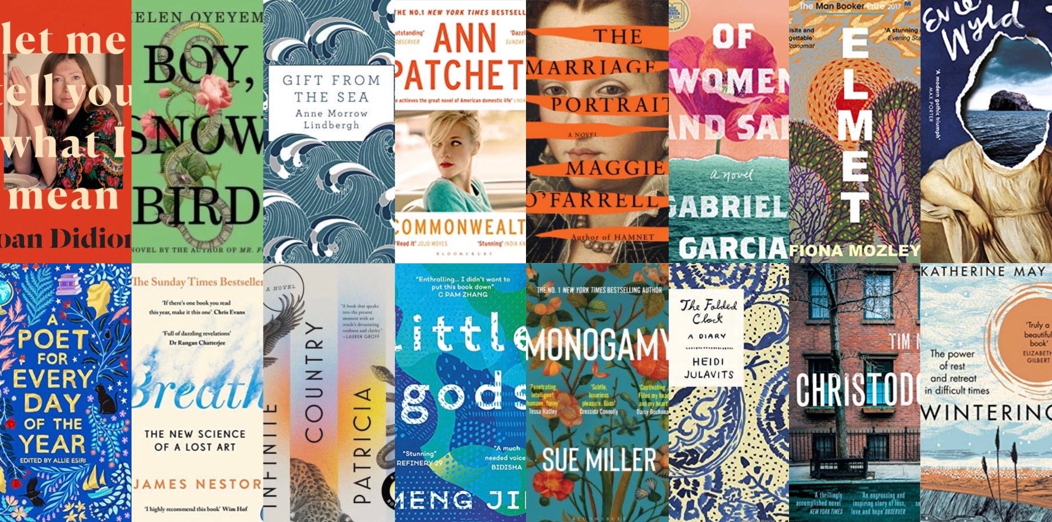
Pps. I’ve shared a few collages of my favourite covers in this post - many I own/have read, some are on my TBR pile, and others are just lovely in their own right. Sue Miller’s Monogamy and Meng Jin’s Little Gods get two inclusions as both the hardback and paperback versions were equally glorious.
My budget really being whatever was left until I reached my overdraft limit each month; organised people would have gone to the library in that situation, but I was so forgetful that my fines often ended up exceeding the cost of the book; it was simply too risky an activity as a student.
Our A-level English teacher (and by our, I mean my and my sister’s, because this is something we both remember) always said people should never use the word nice - that it’s bland and nondescript, but I don’t feel like that about it - I think there’s something simple and complete about it. Books are just nice.
The second photo down is actually an old one I pulled up to illustrate this post because I remembered the Jhumpa Lahiri book was in it - how strange that the bottom two in this stack are published by Bloomsbury and 4th Estate. Also note, the cover shown on Amazon is not the duck-egg beauty pictured here…what could have happened???
CMB may have been a man, but that’s not the history written inside my head, where she exists as Catherine May Boyd, so I like to refer to her as she. I’ve noticed the V&A cite her initials left to right, MCB, but I naturally read it top line, then bottom line, making it CMB.
Loved Drive Your Plow both as an audiobook and a conventional book. Highly recommended if you are into quirky narrators.
I'm drawn to a beautiful book cover especially if it shows some needlework, sewing paraphernalia or fabric, or if it has a sewing/textile related. I am trying to break this habit and expand my choices. As others have said, it's not the best way to choose a book. Recommendations are always good which is why I like your newsletter. It helps me expand my outlook and perhaps read something I wouldn't normally choose. One book that was recommended to me many years ago is "We need to talk about Kevin" by Lionel Schriver. I would never have picked up it up in a book shop but, despite the harrowing story, it's one of the books that has stayed with me. I think that's the barometer of a good book, if you can recall the story and it still has an effect on you.